Amazing Heroes Issue #126— Cover
Dublin Core
Title
Amazing Heroes Issue #126— Cover
Subject
Periodical
Comic Strips
Comic Strips
Description
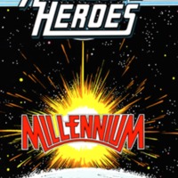
The cover of Amazing Heroes issue 126 features the word “Millennium” in bold, red, capital letters. Above Amazing Heroes, it denotes that the issue is no. 126, was published on October 1st, and is $2.50 in the United States and $3.75 in Canada. It’s set in outer space, with the word placed in front of a blazing sun, sitting above Earth, which is halfway exposed. The classic Amazing Heroes text lies right at the top of the comic, above the sun. It’s shown in bold, white, capital letters, with five blue lines running from each side of it. The dark sky in the background is dotted with stars, and it’s clear that something explosive and new is about to occur. All of the colors used, besides white and black, are incredibly vibrant and contrast well against each other. This cover is a statement piece of sorts, welcoming readers into an issue that’ll expose the new, the fresh, the start of a beginning, just like the millennium itself.
The purpose of having “Millennium” on the cover in outer space is to signify a period of change and additionally introduce the new crossover series. According to Merriam-Webster, “millennium” is defined as both “a period of 1,000 years” and “a period of great happiness or human perfection.” Placing this word on the cover of the comic indicates that something great and fantastical is entering the comics world. It intrigues the reader and draws them in. Including the title of the crossover series in which most of the comic is based on is important as well. Millennium is an eight-issue miniseries written by Steve Englehart that eventually breeds heroes called the New Guardians, according to Millennium’s wiki page. Putting it on the cover advertises it well, and shows readers that it’s the focus of the comic. Additionally, it’s important to note the colors used on this cover, which serve as a huge indicator of what the comic will bring itself overall. In the article “Comics Color” through DePaul University, it notes the specific science that goes behind choosing specific colors, and how striking colors were used in early mainstream comics to convey overstated actions and the emotions of the characters. Using vibrant reds, greens, and blues contrasted with a black background on the cover conveys the excitement of the comic itself, and the saturation represents something bold and grand— like Millennium itself. Going off of the importance of the design and graphics of the cover, it’s important to note that it’s presented in outer space. In the journal article “Interrelations between Literary Time and Space in Prosaic Texts” by Nataliya Panasenko, it goes into detail about how foreshadowing can represent something important to come in actual texts. While this depiction of outer space is not textual, it DOES serve as a sort of foreshadowing, showing that something epic like space will bring in something new and fresh to the comic world— it says more than just a drawing of the Earth that’s not in space.
The purpose of having “Millennium” on the cover in outer space is to signify a period of change and additionally introduce the new crossover series. According to Merriam-Webster, “millennium” is defined as both “a period of 1,000 years” and “a period of great happiness or human perfection.” Placing this word on the cover of the comic indicates that something great and fantastical is entering the comics world. It intrigues the reader and draws them in. Including the title of the crossover series in which most of the comic is based on is important as well. Millennium is an eight-issue miniseries written by Steve Englehart that eventually breeds heroes called the New Guardians, according to Millennium’s wiki page. Putting it on the cover advertises it well, and shows readers that it’s the focus of the comic. Additionally, it’s important to note the colors used on this cover, which serve as a huge indicator of what the comic will bring itself overall. In the article “Comics Color” through DePaul University, it notes the specific science that goes behind choosing specific colors, and how striking colors were used in early mainstream comics to convey overstated actions and the emotions of the characters. Using vibrant reds, greens, and blues contrasted with a black background on the cover conveys the excitement of the comic itself, and the saturation represents something bold and grand— like Millennium itself. Going off of the importance of the design and graphics of the cover, it’s important to note that it’s presented in outer space. In the journal article “Interrelations between Literary Time and Space in Prosaic Texts” by Nataliya Panasenko, it goes into detail about how foreshadowing can represent something important to come in actual texts. While this depiction of outer space is not textual, it DOES serve as a sort of foreshadowing, showing that something epic like space will bring in something new and fresh to the comic world— it says more than just a drawing of the Earth that’s not in space.
Creator
Kevin Dooley, Doug Erb, Kim Thompson, Dave Hall, Donald K. Niven, Audi Paden, Coco Shinomiya, L.M. Gorell, Arlene Easter, Mark Thompson, Rachel Enger
Source
MSU Special Collection Comic Art, PN6725.A47
Publisher
Fantagraphics Books, Inc.
Date
October 1st, 1987
Contributor
Autumn Miller
Rights
All rights reserved
Relation
-http://chambl91.msu.domains/CriticalFanscape/items/show/22 (Table of Contents)
-http://chambl91.msu.domains/CriticalFanscape/items/show/23 (Representative Page)
-http://chambl91.msu.domains/CriticalFanscape/items/show/23 (Representative Page)
Format
Comic, 6.6x10.3 inches, color
Language
English
Type
Periodical
Coverage
1981-1992
Files
Collection
Citation
Kevin Dooley, Doug Erb, Kim Thompson, Dave Hall, Donald K. Niven, Audi Paden, Coco Shinomiya, L.M. Gorell, Arlene Easter, Mark Thompson, Rachel Enger, “Amazing Heroes Issue #126— Cover,” Critical Fanscape, accessed October 17, 2026, https://chambl91.msu.domains/CriticalFanscape/items/show/21.